18 Best Front Door Paint Colors for a Modern, Eye-Catching Look
Your Front Door Deserves More Credit
We all obsess over kitchen backsplashes, bedroom wall paint, or even drawer knobs.
But our front door? It often gets left out of the party. And honestly, that’s a missed opportunity. Your front door is literally the first impression your home makes.
It sets the tone, gives off a vibe, and even boosts curb appeal if you’re thinking of selling.
So, if your door is still that faded beige from the early 2000s, let’s fix that.
I’ve rounded up 18 front door color ideas that are actually practical, realistic, and guaranteed to get your neighbors talking (in a good way).
Why Front Door Colors Matter
Changing your front door color isn’t just a style upgrade, it’s a mood setter. A color can say “Hey, I’m modern and minimal” or “I love cozy cottage vibes.”
It can feel warm and welcoming, bold and daring, or calm and classy.
Here’s why picking the right color matters:
- Curb Appeal: The right color can instantly elevate your exterior.
- Personality: It reflects your style and vibe.
- Perception: Believe it or not, color influences how others feel about your home.
Alright, let’s get into it.
1. Classic Black
There’s just something about a sleek black door that screams timeless and confident.
I painted my aunt’s old cherry wood door matte black last summer and wow, it gave the entire entryway a fresh, updated look without changing anything else.
Why it works:
- Matches literally any house style (modern, farmhouse, colonial… you name it!)
- Dirt and fingerprints don’t show up easily
- Adds depth and elegance instantly
Design Tips:
- Pair with brass or gold hardware for a luxe touch
- Add green plants on either side to soften the boldness
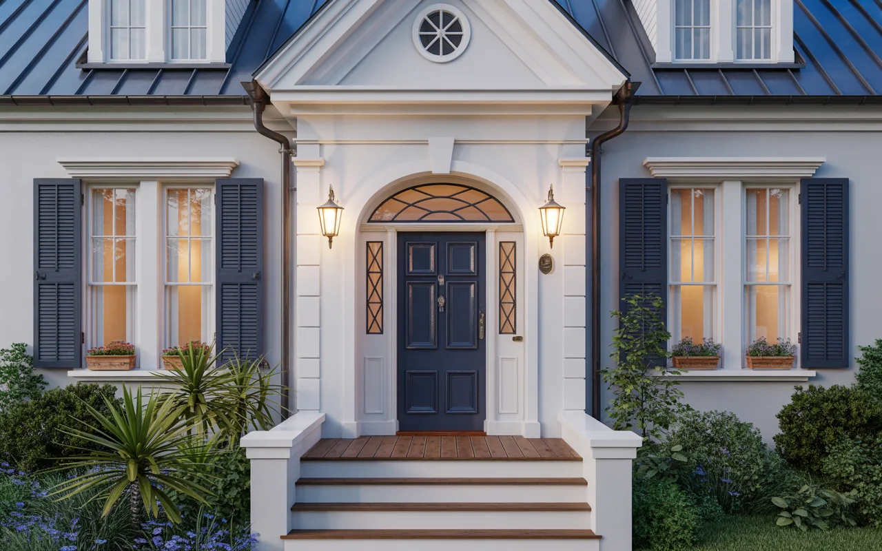
2. Deep Navy Blue
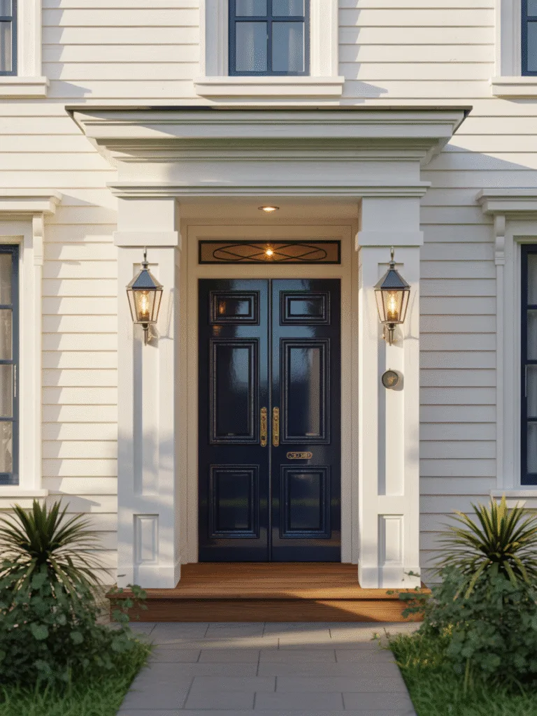
If black feels a little too bold but you still want that sophisticated vibe, go for navy blue.
My cousin used a navy door with white trim and some nautical-style lights, and now her home gives total Cape Cod energy.
Why it works:
- Feels calm but strong
- Great with both brick and white siding
- Slightly less intense than black, but still dramatic
Key Points:
- Looks stunning with silver hardware
- Try a glossy finish for that polished, upscale look
3. Forest Green
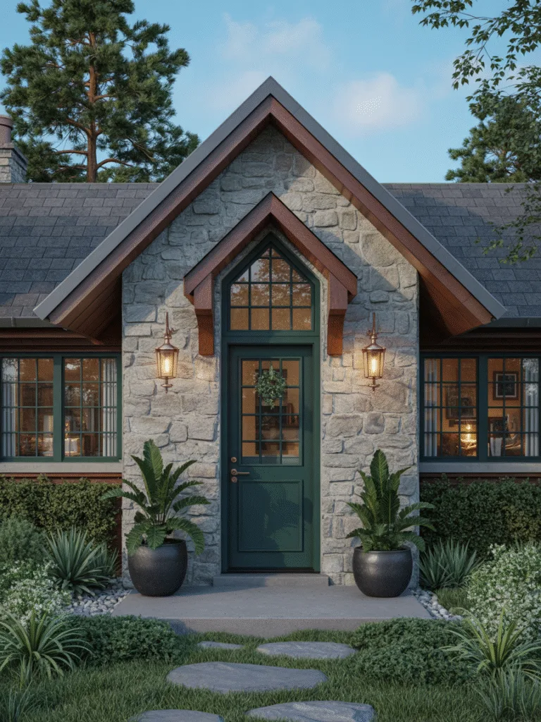
Forest green is having a major moment. And it’s easy to see why.
I recently helped a friend repaint his cottage-style home’s front door a rich green, and it made the stone exterior pop beautifully.
Why it works:
- Feels earthy and warm
- Blends well with natural surroundings
- Offers a subtle pop of color without being loud
Try This:
- Pair with bronze or black accents
- Add a wreath or seasonal decor for extra charm
4. Warm Terracotta
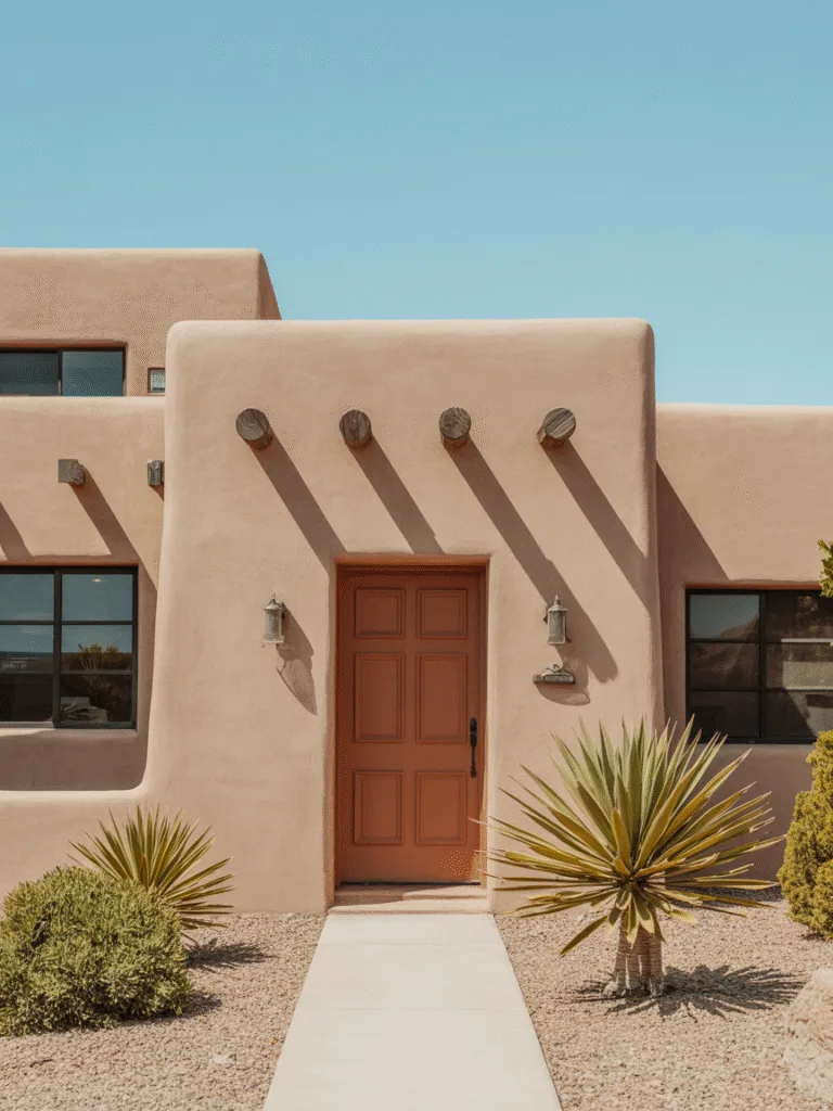
Terracotta doesn’t have to live only in flower pots!
I fell in love with this color when I visited a Southwest-style Airbnb. The terracotta door made the beige stucco walls feel so much more alive.
Why it works:
- Adds instant warmth
- Works well with clay, tan, or light grey exteriors
- Unusual without being too wild
Design Tips:
- Looks amazing with matte black fixtures
- Complement with succulent planters or desert landscaping
5. Sunny Yellow
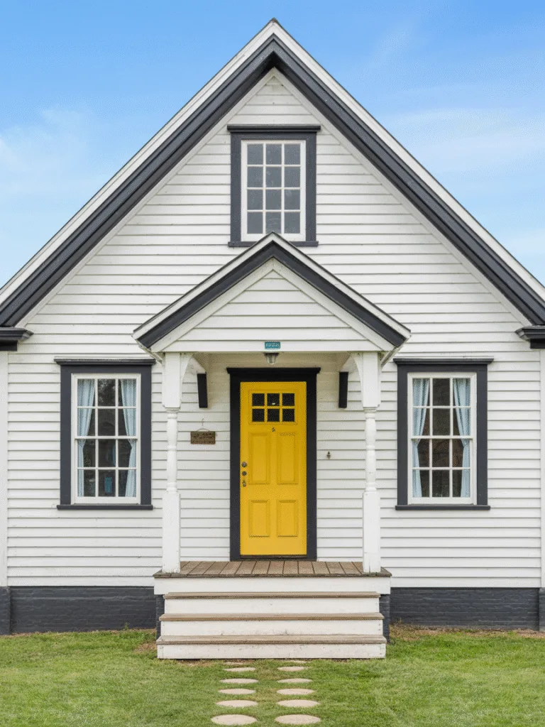
This one’s for the bold and cheerful types.
A bright yellow front door brings energy and friendliness. My friend tried it on her white farmhouse, and it’s the ultimate smile-inducer.
Why it works:
- Adds an instant pop of personality
- Great for homes that need a little lift
- Works best in moderate doses
Tips for Success:
- Keep the surrounding colors neutral
- Use white or black trim to keep it grounded
6. Soft Sage Green
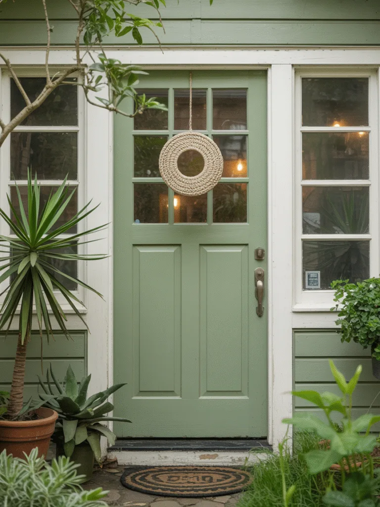
This one’s a personal favorite.
When I painted our rental home’s front door sage green, our landlord was so impressed he offered to reduce our rent. Not kidding!
Why it works:
- Feels fresh, calming, and modern
- A great alternative to neutrals
- Perfect for homes with lots of greenery around
Try Pairing With:
- Brushed nickel hardware
- Woven doormat and natural wood accents
7. Bold Red
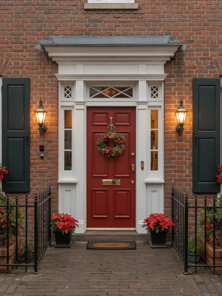
You can never go wrong with a statement red front door. It’s traditional, iconic, and always noticed.
My grandma’s had a red door for 30+ years, and it still looks just as inviting as day one.
Why it works:
- Symbolizes welcome and good luck in many cultures
- Works best with neutral house colors
- Timeless but also bold
Quick Tips:
- Choose a true red or slightly muted tone
- Add a classic brass knocker for that storybook feel
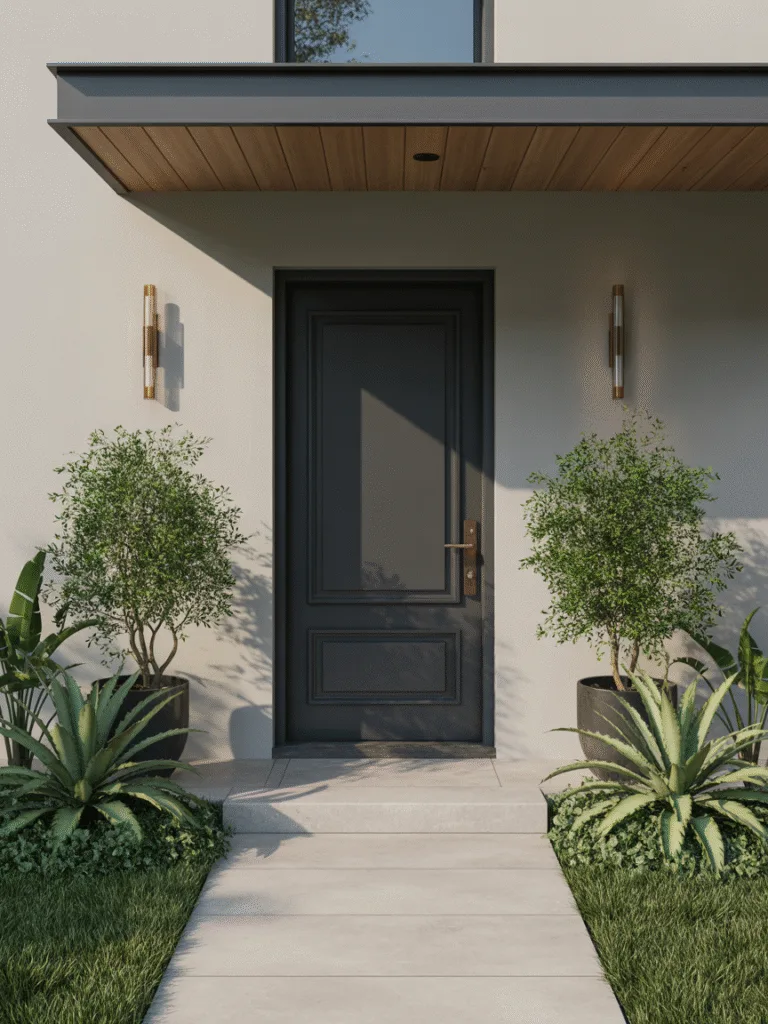
8. Moody Charcoal Gray

If black feels too dark but white feels too light, charcoal is your middle ground.
I tried this on a modern home with wood panel siding and it instantly added depth without drama.
Why it works:
- Subtle but sleek
- Goes with most home exteriors
- Easier to maintain than pure black
Design Ideas:
- Pair with industrial lighting for a modern look
- Use gloss or satin finish to avoid it looking flat
9. Cheerful Teal
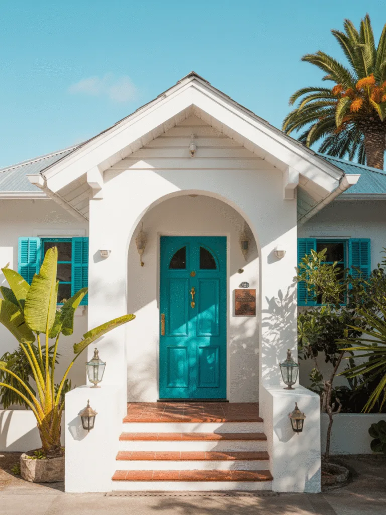
Teal might not be the first color you think of, but it brings so much personality.
It’s like that one fun friend who’s always the life of the party. When used right, it can really make your home stand out.
Why it works:
- Playful but still stylish
- Goes beautifully with white, cream, or brick
- Adds a hint of coastal charm
Design Suggestions:
- Accent with gold or brushed bronze fixtures
- Keep the surrounding palette simple to let teal shine
10. Crisp White
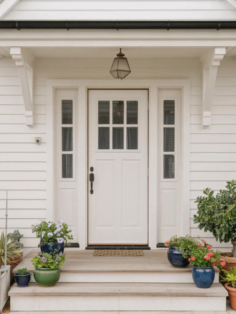
Yep, sometimes simple is best.
A white door doesn’t have to be boring if it’s done intentionally. It can feel clean, fresh, and modern, especially when everything around it is colorful.
Why it works:
- Ultra-clean and minimal
- Helps other design elements pop
- Great for modern or coastal homes
To Make It Work:
- Use black or dark hardware to add contrast
- Keep it pristine with regular cleaning
11. Dusty Rose
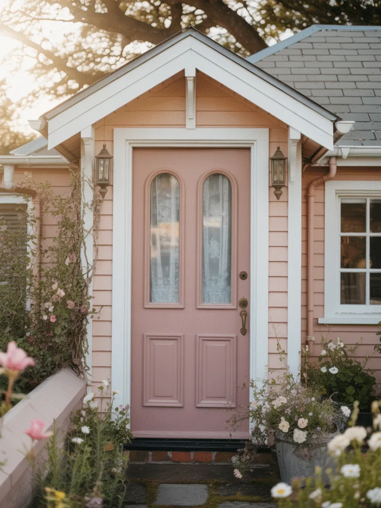
If you love soft, romantic vibes, dusty rose is your new secret weapon.
I spotted this color on a vintage-inspired bungalow and immediately snapped a photo. It’s warm without being too pink and works surprisingly well with earthy exteriors.
Why it works:
- Adds a touch of elegance without being too feminine
- Looks amazing on older homes with character
- Pairs beautifully with warm-toned stone or siding
Design Tips:
- Use aged brass or antique bronze hardware
- Add a floral wreath for an even more charming entry
12. Pumpkin Spice
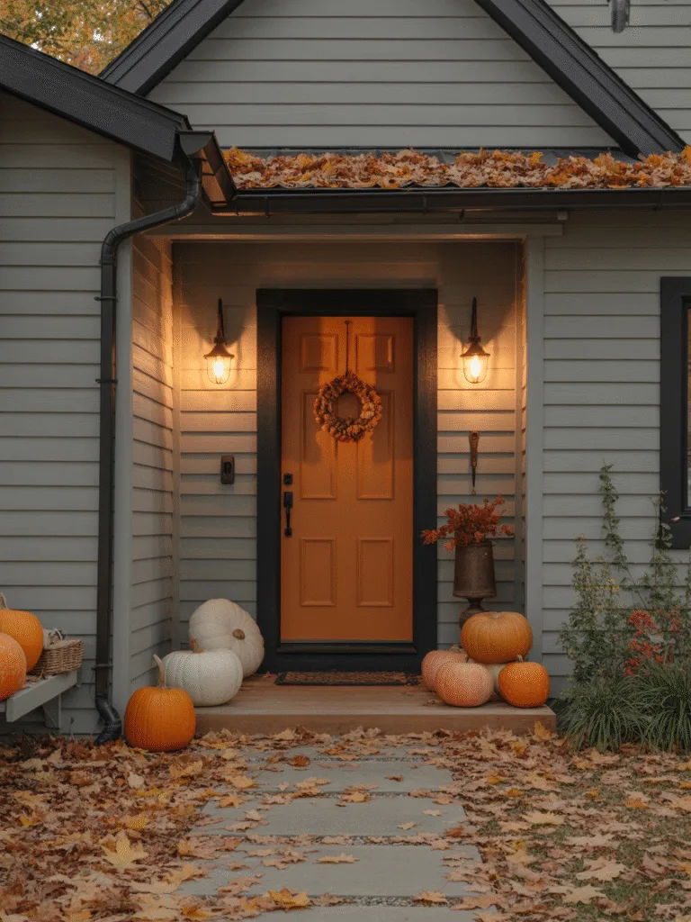
Yes, like the latte—but trust me, it’s not just for fall lovers!
A rich burnt orange door feels warm and cozy year-round. I helped a neighbor paint hers this shade, and it made her gray siding and white trim absolutely glow.
Why it works:
- Feels inviting and unique
- Pairs great with neutral or cool-toned exteriors
- Adds seasonal flair without needing decorations
Key Points:
- Try with matte black or dark brown hardware
- Great option for homes in cool climates—it visually warms things up
13. Lavender Gray
Lavender gray isn’t flashy—it’s subtle, moody, and totally unexpected.
I saw this combo on a mid-century home with wood accents and fell in love. It’s soft enough to be neutral, but with just a kiss of color.
Why it works:
- Blends gray sophistication with floral softness
- Ideal for modern and minimalist homes
- Adds depth without being dramatic
Try This:
- Match with silver or brushed nickel fixtures
- Accent with potted lavender or gray planters for a cohesive theme
14. Olive Green
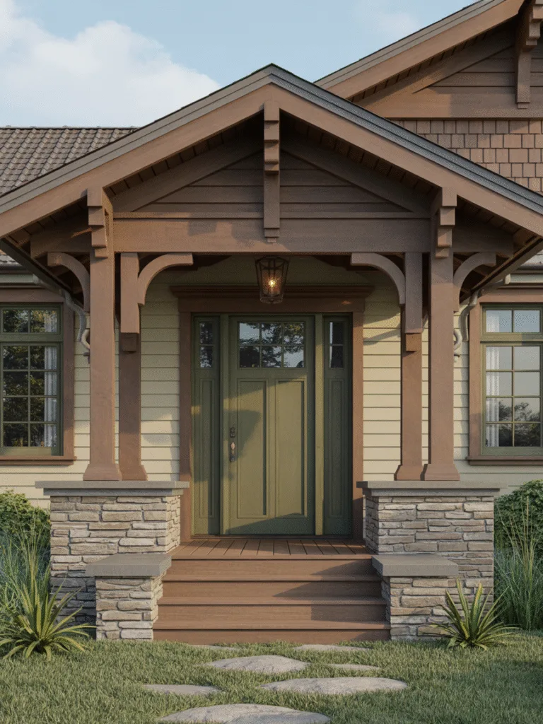
Olive green is the introvert of front door colors—calm, grounded, and stylish.
We chose this for a friend’s craftsman-style home, and it melted into the landscaping in the best way possible. Understated but unforgettable.
Why it works:
- Has a natural, organic feel
- Complements brick, beige, and wood exteriors
- Feels rustic without trying too hard
Design Suggestions:
- Pair with aged bronze hardware
- Great for homes with lots of greenery or wood tones
15. Coral
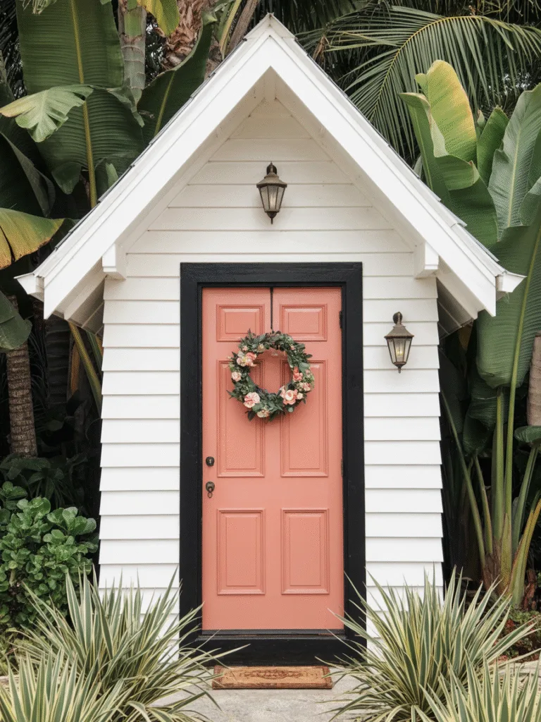
Looking to make your house pop without going neon? Try coral.
This one surprised me. A coral front door on a white cottage-style house was so cheerful I wanted to knock just to say hi.
Why it works:
- Bright, but not overwhelming
- Adds a fun, tropical touch
- Works well with lighter sidings like cream or beige
Design Tips:
- Try with glossy finish to catch more light
- Keep other accents minimal so coral stays center stage
16. Slate Blue
This is the grown-up cousin of navy—a little softer, a little dustier.
My neighbor’s craftsman home has a slate blue door with white trim and black hardware. It’s classy without being cold and feels both modern and timeless.
Why it works:
- Works beautifully with gray, white, or beige exteriors
- Adds color without looking too bold
- Great for people who want a hint of personality
Key Details:
- Best with satin or matte finishes
- Complements stone or brick details nicely
17. Mint Green
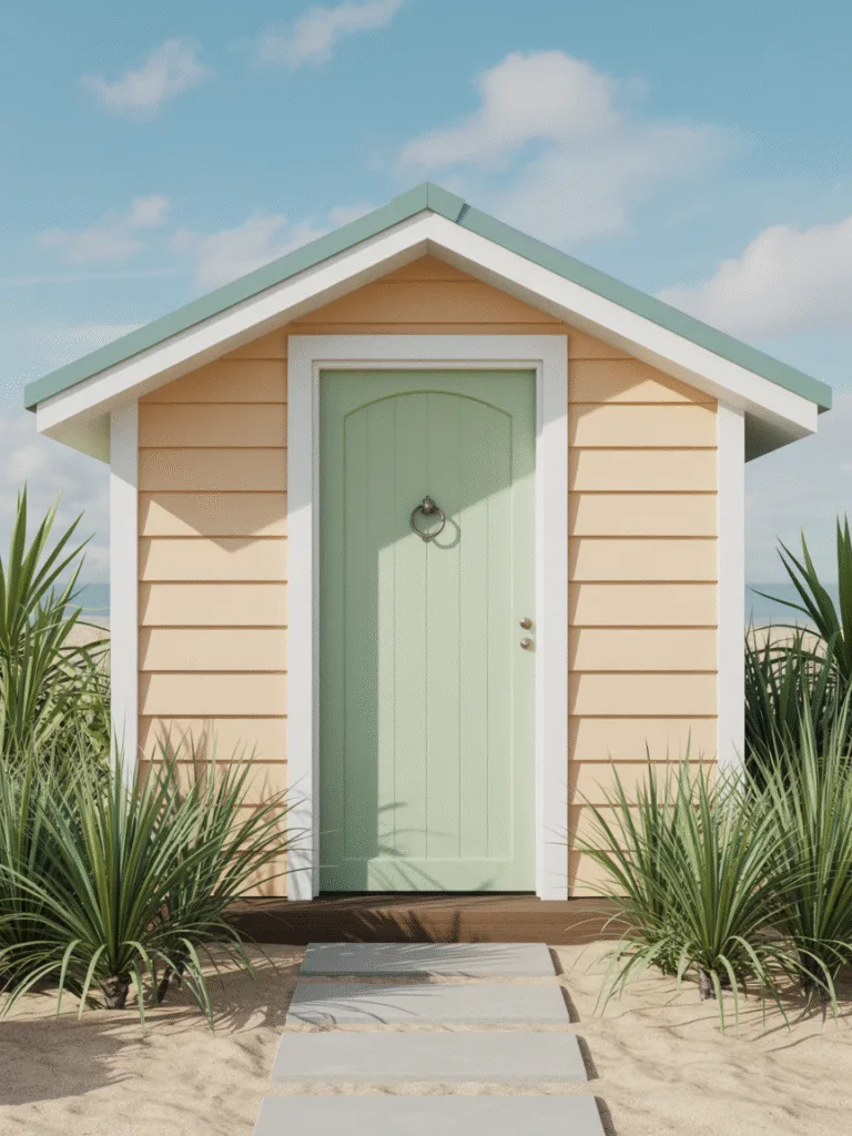
There’s something irresistibly cheerful about mint green.
I painted my garden shed door this color and loved it so much I considered doing the front door too. It’s light, fun, and full of charm.
Why it works:
- Soft and sweet without being childish
- Looks great on cottages, beach houses, and bungalows
- Feels vintage and modern at the same time
Try Pairing With:
- White or cream trim for a crisp contrast
- Quirky doorknob or vintage knocker for added flair
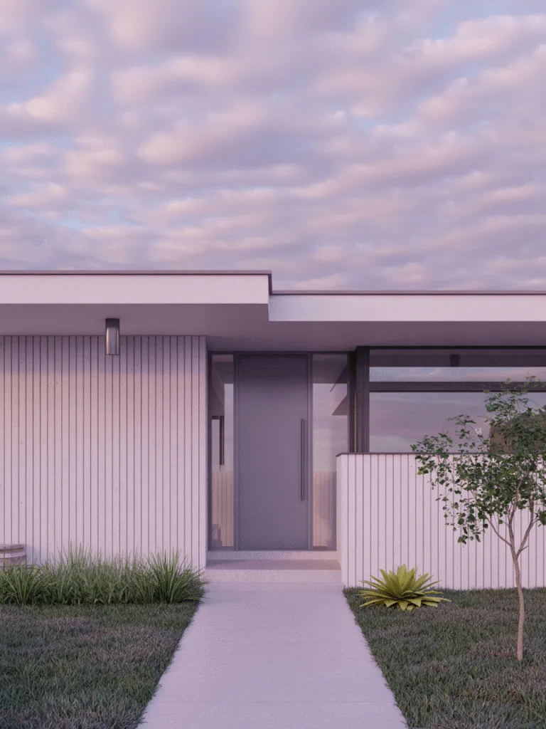
18. Pewter

This one’s for the minimalists. Pewter is like gray with a bit more personality.
A family friend used this on a mid-century modern home, and it gave a cool, industrial look without feeling cold or boring.
Why it works:
- Clean and sleek
- Works great with metal accents or modern lighting
- Subtle enough to change up décor around it easily
Design Tips:
- Use with geometric or linear light fixtures
- Consider a matte finish for a more muted aesthetic
Common Mistakes to Avoid
Even with the right color, things can go wrong. Here are some mistakes to dodge:
- Ignoring the house’s overall style: A bright teal might clash on a classic Tudor home.
- Choosing trendy over timeless: If you’re not planning to repaint often, skip overly trendy shades.
- Skipping the prep work: Clean, sand, and prime your door first. Trust me, you’ll regret skipping this step.
- Mismatched hardware: Your beautiful new color deserves equally thoughtful knobs, knockers, and hinges.
FAQs
How do I choose the right front door color for my home?
Start by looking at your home’s existing elements, roof, trim, siding, and landscaping. Pick a color that complements or adds contrast without clashing. When in doubt, test with paint samples on the actual door.
Is there a color that increases home value?
Neutral tones like black, navy, and red tend to be favorites among homebuyers. They signal timelessness and curb appeal. Zillow even found that homes with black or charcoal doors sell for more!
Can I paint a metal front door?
Absolutely! Just make sure to use paint made for metal surfaces and prep it properly. A light sanding and a good primer can make all the difference.
Glossy or matte finish?
It depends on the look you want. Glossy gives off a polished, formal vibe, while matte or satin finishes feel modern and understated. Matte also hides imperfections better.
Final Thoughts
Your front door might seem like a small detail, but changing its color can totally shift your home’s vibe.
Whether you go bold, soft, or somewhere in between, choose a color that feels like you.
After all, it’s the first hello your home says to the world, make it count.