18 Relaxing Bathroom Paint Colors That Feel Like a Spa Escape
Let’s be real, there’s nothing better than walking into your bathroom after a long day and instantly feeling calm.
And guess what? The right paint color can do just that.
Whether you’re all about spa vibes or just want a space that doesn’t scream chaos, I’ve got some soothing shades that’ll totally transform your bathroom.
Why Paint Color Matters in a Bathroom
I used to think bathrooms were all about tiles and towels. But after painting mine a soft green, it hit me, paint sets the entire mood.
The right color can make a small space feel bigger, brighter, and way more relaxing.
Here’s why your bathroom paint choice is a big deal:
- Creates a calming atmosphere that sets the tone for your day.
- Can completely change the look and feel of a small or windowless bathroom.
- Helps coordinate with towels, rugs, and decor for a pulled-together vibe.
- Boosts resale value with fresh, neutral tones.
Trust me, a new paint job is one of the cheapest and most satisfying upgrades you can do!
1. Soft Sage Green
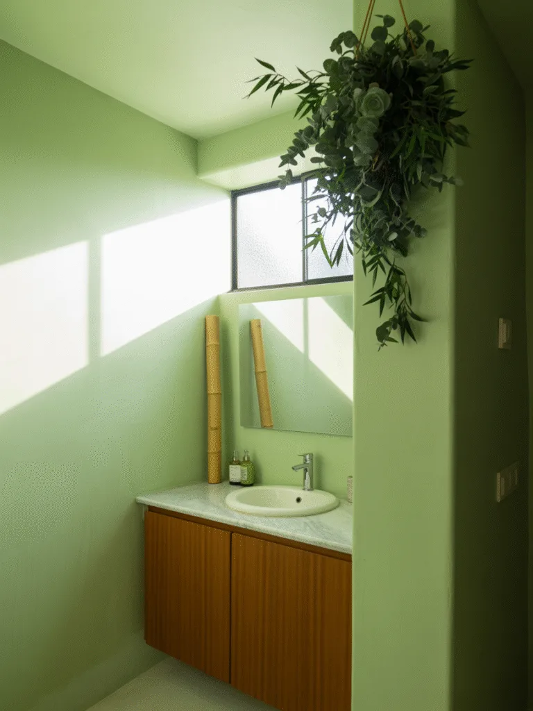
There’s just something magical about sage green. It gives off those fresh, spa-like vibes without feeling cold or clinical.
- I painted my guest bath in sage and everyone always comments on how calming it feels.
- Works amazingly with natural elements like wood, wicker, or bamboo.
- Perfect if you love greenery but want something subtler than actual plants.
Design Tips:
- Pair with white or beige tiles.
- Add eucalyptus bundles or woven baskets for that extra spa feel.
- Choose a matte finish for a soft, organic look.
Why It Works: Sage green mimics nature, making it one of the most peaceful colors you can choose.
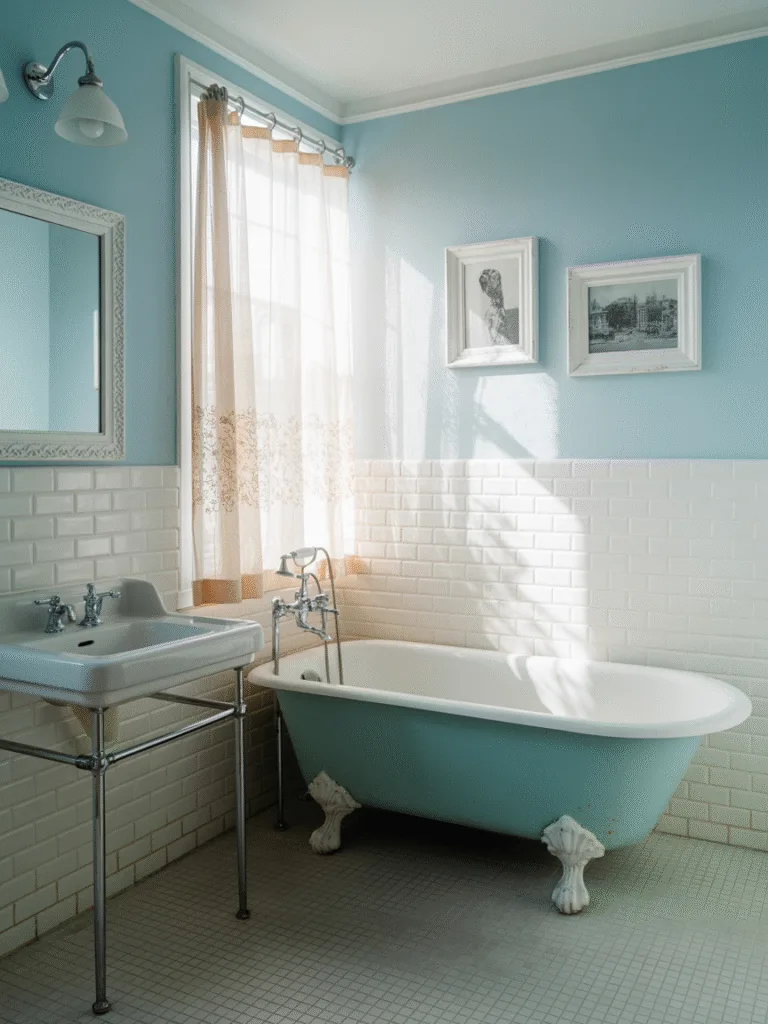
2. Pale Sky Blue
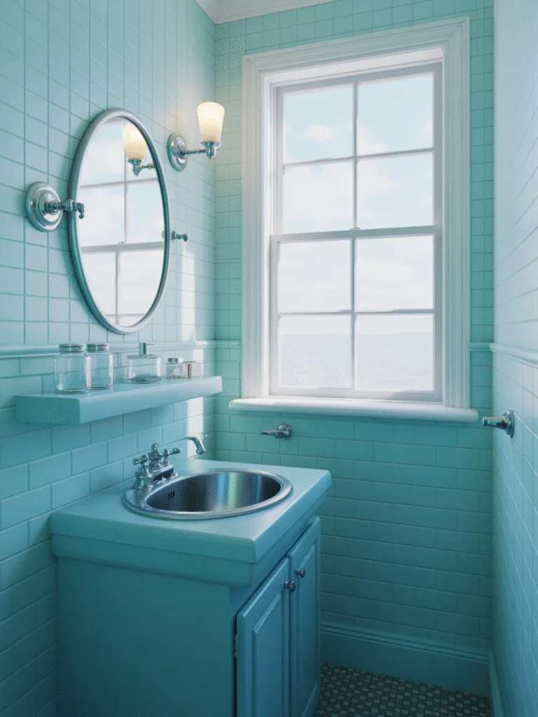
This shade reminds me of those early morning skies, totally chill and full of promise.
- Makes your bathroom feel airy and open, especially if it’s a small space.
- Plays nicely with white trim and silver fixtures.
- Adds color without overwhelming the space.
Design Tips:
- Use glass accents like jars or pendant lights to reflect light.
- Hang a cloud print or a watercolor art piece for subtle charm.
Why It Works: Sky blue reduces mental stress and creates a clean, fresh backdrop.
3. Warm Greige
Can’t decide between gray or beige? Greige gives you the best of both worlds.
- Offers a warm, modern look that fits literally any style.
- Works beautifully with metallics like gold or copper.
- Doesn’t show dust or water marks easily (yes, please).
Design Tips:
- Pair with earth-toned towels and mats.
- Add wooden elements for a cozy, spa feel.
- Try it with soft lighting to make the warmth pop.
Why It Works: Greige is versatile, calming, and chic without being boring.
4. Creamy White
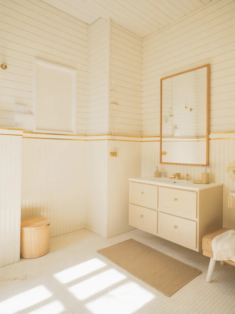
This isn’t your basic rental white. A creamy, soft white brings instant peace.
- Reflects natural light and makes any space feel bigger and brighter.
- Pairs with literally everything.
- Ideal if you want to switch up decor often.
Design Tips:
- Use textured elements like shiplap or wainscoting to add dimension.
- Layer in beige, gold, or wooden accents.
Why It Works: Creamy white acts as a clean canvas while still feeling cozy and serene.
5. Blush Pink
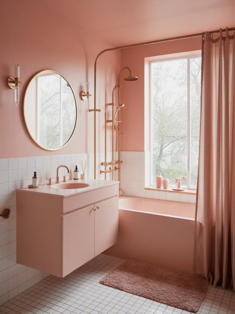
Hear me out, blush pink is not just for little girls’ rooms. In the right tone, it’s romantic, soft, and super chic.
- Works wonderfully in natural light.
- Adds a soft warmth without going full Barbie.
- Creates a cozy cocoon feel.
Design Tips:
- Use rose gold or brushed brass accents.
- Keep the rest of the palette neutral to avoid overdoing it.
Why It Works: Blush pink brings warmth and calm, and looks especially good with wood and gold.
6. Cool Mist Gray
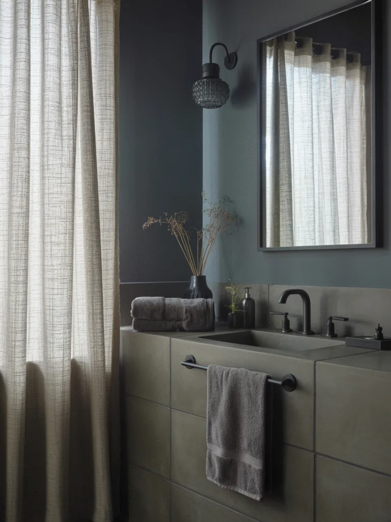
If you’re a minimalist at heart, this one’s for you. Misty gray is the color of foggy mornings and chill evenings.
- Adds a sleek, modern vibe without feeling sterile.
- Works with black, chrome, or even soft wood tones.
- Ideal for both small and large bathrooms.
Design Tips:
- Pair with concrete-look tiles or matte black fixtures.
- Use layered textures (like waffle towels or linen curtains).
Why It Works: Cool gray promotes mental clarity and quiet, making it ideal for unwinding.
7. Ocean Teal
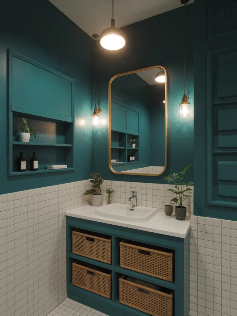
Teal is bold, but in a deep ocean tone? It’s total zen.
- Gives the feeling of being underwater in the best way.
- Works especially well with gold or brass details.
- Looks luxe and unexpectedly relaxing.
Design Tips:
- Use white tile to balance the richness.
- Add woven or cane elements to keep it grounded.
Why It Works: Deep teal mimics ocean depths, bringing a moody calm to your space.
8. Dusty Lavender
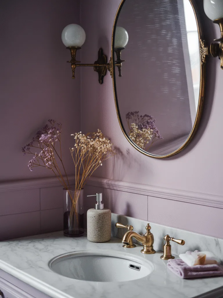
This one’s a bit romantic, a bit mysterious, and totally soothing.
- Feels sophisticated but still warm.
- Blends beautifully with light grays and whites.
- Adds a pop of color without being loud.
Design Tips:
- Pair with antique mirrors or brass finishes.
- Use marble or stone accessories to elevate the vibe.
Why It Works: Lavender has natural relaxing properties, and this muted version brings them into your decor.
9. Soft Taupe
Taupe is like your favorite cozy sweater. You barely notice it, but you feel it.
- A great option if you want something warmer than gray but still neutral.
- Matches easily with both modern and rustic decor.
- Adds a soft, earthy depth.
Design Tips:
- Combine with beige or cream linens.
- Add dried florals or stone accessories.
Why It Works: Taupe feels natural and grounding, perfect for a calming bath space.
10. Powder Blue
This vintage shade brings a soft, sweet vibe that never feels too done.
- Looks fantastic in natural or low light.
- Combines well with whites and silvers.
- Adds subtle character.
Design Tips:
- Add vintage or French-style decor pieces.
- Mix in soft florals or lace textiles.
Why It Works: Powder blue has nostalgic calm energy, great for quiet mornings or evening wind-downs.
11. Pale Apricot
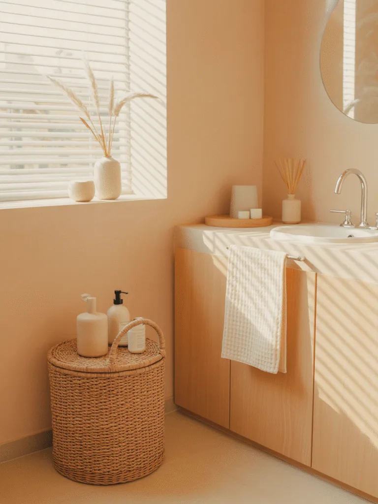
This shade feels like warm morning sunshine—light, cheerful, and gentle on the eyes.
- Great if you want something warmer than cream but not as bold as orange.
- Adds a soft glow that feels instantly uplifting.
- Ideal for spaces that don’t get a lot of natural light.
Design Tips:
- Pair with white trim and natural wood accents.
- Try woven baskets or stone accessories to enhance that earthy tone.
Why It Works:
Pale apricot brings warmth and brightness without being too loud, making your bathroom feel cheerful but calm.
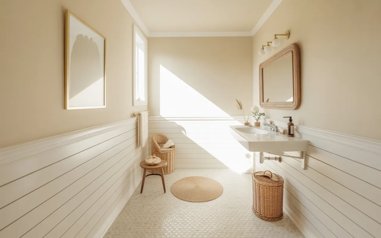
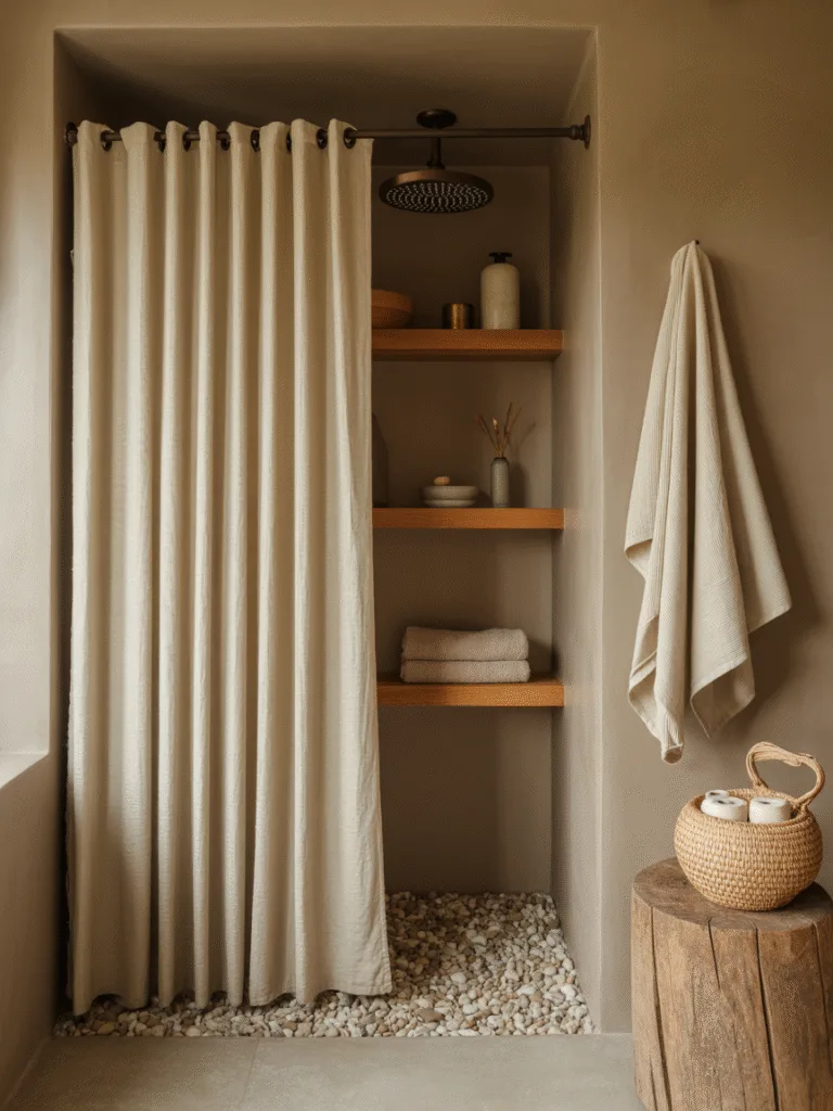
12. Whisper Beige
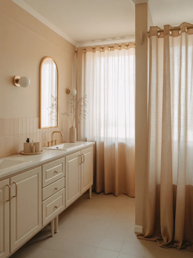
If you want the vibe of soft sand between your toes, this is it. Whisper beige is subtle, cozy, and totally fuss-free.
- Perfect for anyone who loves neutrals but wants more depth than white.
- Super flexible—works with modern or traditional decor.
- Makes everything feel instantly softer.
Design Tips:
- Pair with linen curtains and natural textures.
- Add white ceramics or brass fixtures for contrast.
Why It Works:
Whisper beige feels timeless and comforting, giving you a bathroom that always looks clean and cozy.
13. Seafoam Green
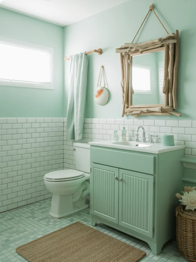
This one reminds me of beach glass—cool, soft, and fresh as an ocean breeze.
- Works beautifully in coastal, boho, or vintage-inspired bathrooms.
- Adds a hint of color without being overpowering.
- Super refreshing on a hot day or first thing in the morning.
Design Tips:
- Use white subway tiles or sandy-toned flooring.
- Accent with seashells, jute rugs, or driftwood.
Why It Works:
Seafoam brings coastal tranquility into your space and instantly lightens the mood.
14. Buttercream Yellow
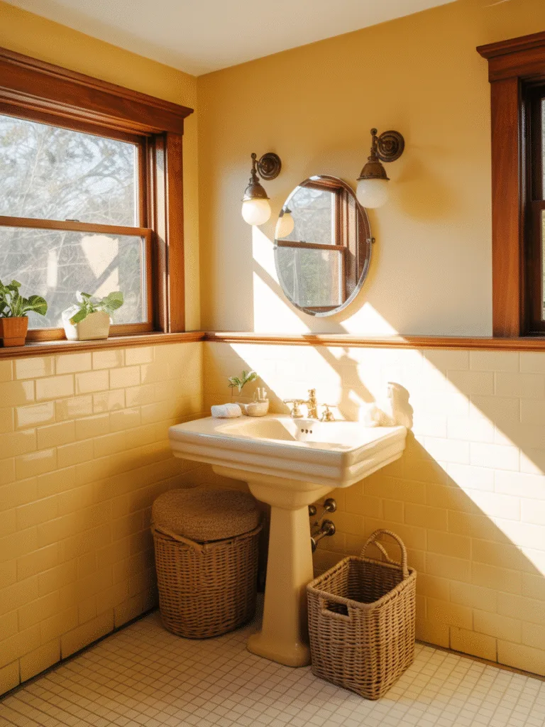
Soft, sweet, and totally sunshine-y—but in a gentle way.
- Brightens up small or windowless bathrooms.
- Pairs wonderfully with warm woods and neutrals.
- Feels cheerful without being garish.
Design Tips:
- Use soft white trim and natural elements like rattan or cotton.
- Keep accessories minimal for a clean look.
Why It Works:
Buttercream yellow brings joy and warmth, which helps wake you up on groggy mornings.
15. Mushroom Gray
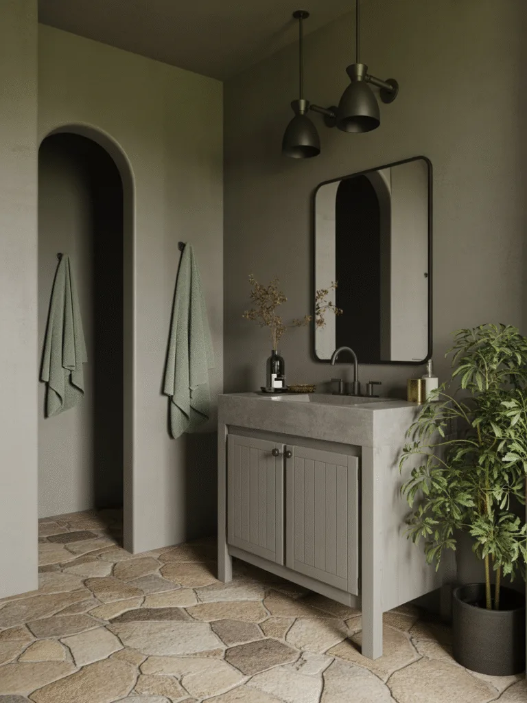
This gray-brown hybrid has a grounding, earthy feel that’s seriously underrated.
- It’s neutral, but with personality.
- Amazing for rustic, Scandinavian, or minimalist bathrooms.
- Feels warm without going beige.
Design Tips:
- Combine with stone tiles and matte black accents.
- Add greenery for a natural contrast.
Why It Works:
Mushroom gray is calm and grounded, creating a space that feels natural and balanced.
16. Cloud White
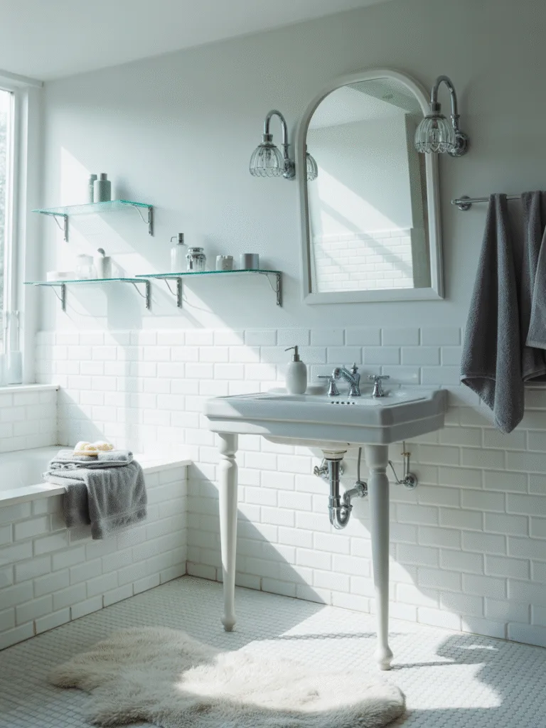
Think fluffy, soft, airy—not your typical plain white.
- Slight blue or gray undertones keep it from feeling stark.
- Makes small spaces feel airy and open.
- Reflects light beautifully, even on gloomy days.
Design Tips:
- Pair with silver fixtures and clear glass accents.
- Add soft gray towels or decor for layering.
Why It Works:
Cloud white feels crisp and dreamy, making it a go-to for calm and clean bathrooms.
17. Misty Rose
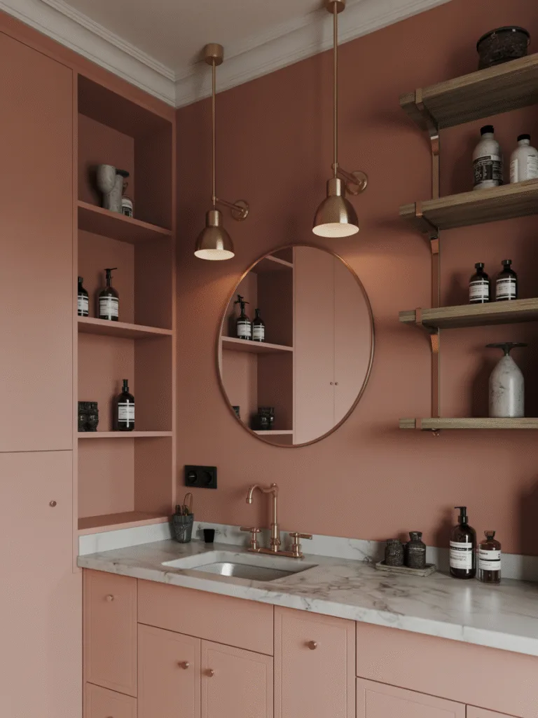
This muted rose shade is romantic and super calming at the same time.
- Adds just a touch of feminine softness.
- Gorgeous with brass, copper, or gold details.
- Feels both trendy and timeless.
Design Tips:
- Mix in white or taupe tile and warm wood shelves.
- Use glass jars and floral touches to complete the look.
Why It Works:
Misty rose creates warmth and charm, perfect for a relaxing, cozy bathroom experience.
18. Slate Blue
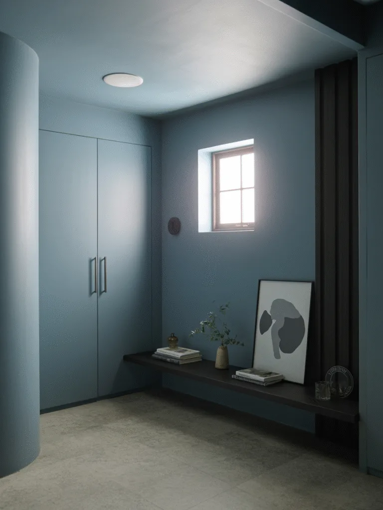
A little deeper than sky blue, this one feels sophisticated, cool, and oh-so-relaxing.
- Offers more depth without feeling heavy.
- Works amazingly well in modern or farmhouse bathrooms.
- Looks incredible with both light and dark accents.
Design Tips:
- Try white trim and brushed nickel fixtures.
- Accent with natural wood or pebble flooring.
Why It Works:
Slate blue brings in a calm, reflective vibe, perfect for winding down after a long day.
Common Mistakes to Avoid
Before you grab your paint roller, keep these in mind:
- Ignoring natural light: Some colors look totally different under artificial vs. natural light.
- Going too bold in a tiny space: Stick to soft or muted tones to keep it cozy, not chaotic.
- Not testing swatches: Always test samples on your bathroom wall before committing.
- Forgetting the finish: Go for satin or semi-gloss for bathrooms, they resist moisture better.
FAQs
What is the most relaxing color for a bathroom?
Soft greens, blues, and creamy neutrals tend to be the most calming. Think spa vibes.
Can I use dark colors in a small bathroom?
Yes, but use them as accents or on one wall. Balance with lighter elements to avoid feeling closed in.
What finish is best for bathroom paint?
Go for satin or semi-gloss. These finishes are more resistant to moisture and easier to clean.
How do I make my bathroom feel like a spa?
Use calming colors, soft textures, natural elements like wood or plants, and keep clutter minimal.
Final Thoughts
So there you have it, 18 relaxing bathroom paint colors that bring calm, comfort, and a bit of joy into your everyday routine.
Whether you love neutrals or want a gentle pop of color, there’s a shade here that can totally change your space.
Give your bathroom the love it deserves, one brushstroke at a time.